Introduction
Choosing paint tones transforms a property from simple shelter into a place that feels intentional. Color affects mood, perceived space, and how features are noticed. In Richmond, VA, where architectural styles vary from Federal rowhouses to contemporary new builds, selecting appropriate paint tones matters for resale, curb appeal, and comfort. Guidance covers color theory, natural light, room purpose, undertones, finishes, sampling methods, trim and ceiling coordination, color flow between spaces, and working with a real estate agent when preparing a property for market.
Understanding Color Fundamentals
Color begins with hue, saturation, and value. Hue identifies color family. Saturation measures intensity. Value indicates lightness or darkness. Combining these elements creates a palette that either soothes or energizes. Cooler hues like blue and green tend to recede visually, making walls feel farther away. Warmer hues like red and yellow advance, making a room feel cozier. Lower saturation yields a calmer surface that pairs well with patterned fabrics. Higher saturation reads as lively and best used in accents or on a single wall.
Practical tip: sample a small swatch at eye level and view it morning and evening. Observe how the same hue shifts under sunshine and street lamps.
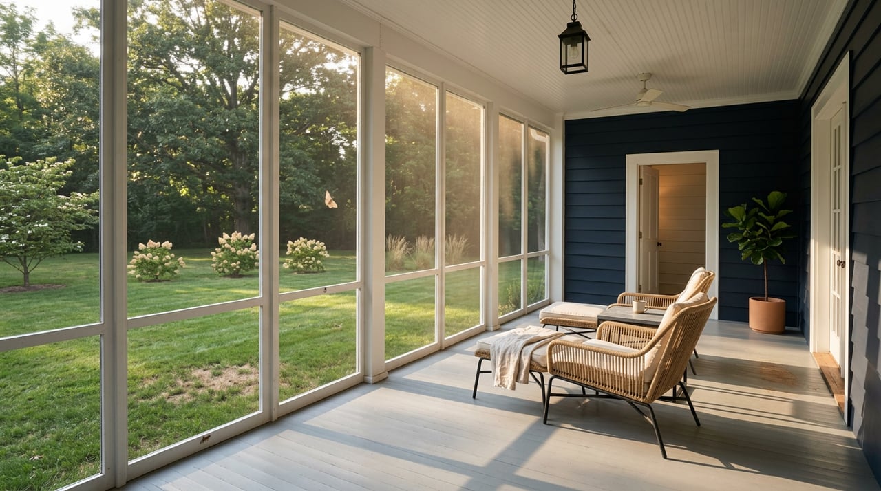
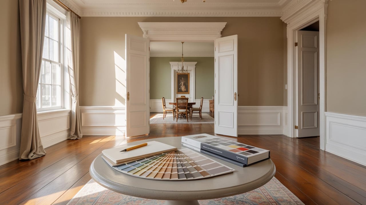
How Natural Light Changes Perception
Natural light alters a tone more than any other factor. North facing rooms in Richmond often receive consistent but softer daylight that can mute warm paints and make cool paints appear more pronounced. South facing rooms collect direct sunlight that warms colors and reveals undertones. East facing rooms glow with warm light in the morning and cooler light by afternoon. West facing rooms gain a warm late light that can intensify reds and oranges.
Practical tip: place test panels on different walls to see how light direction affects each surface through the day. Consider the impact of mature trees common in neighborhoods such as The Fan when estimating available light.
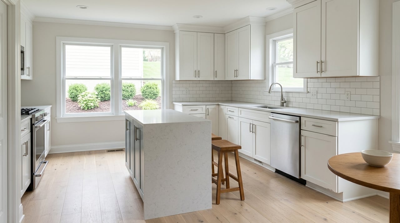
Matching Tones To Room Function
Room purpose should guide color temperature and intensity. Bedrooms benefit from calming neutrals or softened cool hues that promote rest. Living rooms accommodate a wider range depending on whether the goal is intimate conversation or lively entertaining. Kitchens perform well with lighter tones that make surfaces feel fresh and clean, while breakfast nooks can support bolder accents. Home offices call for hues that support concentration; muted midtones work well. Bathrooms respond to soft cools that suggest cleanliness without feeling clinical.
Practical tip: prioritize longevity in main living areas by selecting restrained tones that adapt to different furniture choices over time.
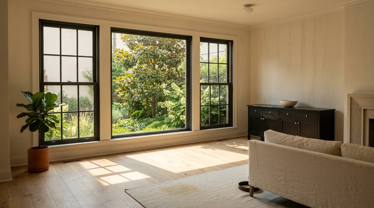
Working With Undertones
Undertones are subtle secondary colors that influence how a paint reads. A gray with a green undertone differs from a gray with a lavender undertone despite similar swatches. Undertones become especially important when pairing paint with existing materials such as hardwood floors, granite counters, or brick facades. For example, Richmond homes with old growth pine floors often pair well with paints that echo warm undertones rather than cool ones.
Practical tip: compare a paint swatch against fixed elements under natural light. If the swatch clashes, test another option with a different undertone until harmony appears.
Choosing Finishes For Function And Effect
Paint sheen changes how light reflects and how surfaces endure use. Flat finishes hide imperfections and yield a soft appearance suited to ceilings and low traffic zones. Eggshell and satin finishes provide subtle luster and are appropriate for living rooms and bedrooms. Semi gloss and gloss deliver durability and ease of cleaning, which is helpful for trim, doors, and kitchens. Finish choice also affects perceived depth; higher sheen heightens color intensity.
Practical tip: select a durable finish for high contact areas while keeping decorative surfaces less shiny to soften the visual field.
Sampling And Testing Strategies
Sampling is essential because large areas read differently than small cards. Paint multiple sample patches that span at least the size of a standard piece of poster board. Observe samples at different times and under varied lighting conditions. Paint adjacent surfaces to evaluate how colors interact. Remove furniture from against the wall when inspecting to avoid reflected color influence.
Practical tip: allow samples to cure for the manufacturer’s recommended time to reveal true coloration before making a final selection.
Coordinating Trim And Ceiling Colors
Trim and ceilings frame rooms and should balance the wall tone. Crisp, cool whites highlight architectural details and provide contrast against midtones. Warm off whites can soften transitions in older houses with vintage trim profiles. Ceilings painted slightly lighter than walls visually lift the room. Painting beadboard or wainscoting in a complementary tone adds depth and visual interest.
Practical tip: test trim against wall swatches and local lighting to ensure that the contrast enhances rather than competes.
Creating Color Flow Between Rooms
Color flow maintains a cohesive experience through a property. Select a primary neutral for shared spaces and introduce secondary accent tones to individual rooms. Use repeating elements such as a particular blue, green, or muted yellow across multiple rooms to create continuity. Transition spaces like halls and stairwells benefit from slightly lighter or darker variations of adjacent room tones to guide movement.
Practical tip: develop a palette with a limited number of principal tones and a few accent shades to avoid an overcomplicated scheme.
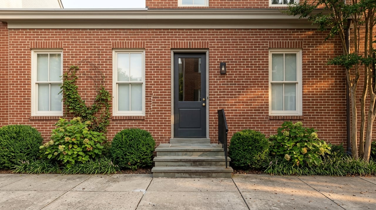
Adapting Palettes To Architectural Style
Architectural details inform color choice. Historic homes in Church Hill or the Fan with ornate cornices and moldings often suit softer period-appropriate palettes that highlight detail without overwhelming it. Contemporary flats or new construction perform well with cleaner, streamlined tones that emphasize form. Exterior brick and stone demand careful coordination; choose wall paints that complement existing masonry rather than compete with it.
Practical tip: research paint colors commonly used during the home’s construction era when working on restorations to maintain period integrity.
Balancing Current Trends With Timelessness
Trends influence available finishes and popular hues, but timeless choices retain resale appeal. Earthy midtones and muted colors remain widely accepted and adapt to styling changes. Modern saturated shades work well in accent areas and can refresh a space without long-term commitment. Incorporating trend colors through accessories or an accent wall keeps the primary palette stable.
Practical tip: use contemporary shades sparingly in areas that can be easily updated to maintain broad appeal.
Working With A Real Estate Agent When Preparing For Market
A real estate agent understands buyer preferences in Richmond neighborhoods and can advise on tones that enhance marketability. Agents observe local comparables and note which palettes attract attention during showings. When preparing a property for listing, coordinate with a real estate agent to prioritize updates that increase curb appeal and interior brightness. For properties with historic value, agents can point to paint approaches that respect original details while appealing to modern buyers.
Practical tip: request agent feedback after sampling key rooms to ensure choices align with local buyer tastes and recent market activity.
Ready to Transform Your Home with Color
Choosing the right paint tones is both an art and a science, and a few thoughtful decisions can dramatically improve how each room looks and feels. Whether you're refreshing a single space or rethinking your entire home—even if you're located in null—consider how light, undertones, and finish will interact in real life. For personalized recommendations and expert color consulting, visit hankcosby.com and get in touch to start your transformation.